How Does India's BRICS 2026 Logo Reflect Global Leadership?

Synopsis
Key Takeaways
- Logo symbolizes resilience and inclusivity.
- Inspired by the lotus, reflecting cultural heritage.
- Namaste gesture conveys respect and dialogue.
- Tagline emphasizes cooperation and sustainability.
- India aims for a diverse coalition in BRICS.
New Delhi, Jan 14 (NationPress) BRICS serves as a significant geopolitical entity in a world filled with challenges, and the newly revealed logo for 2026 reflects India’s recognition of this role.
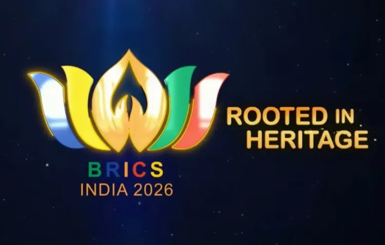
The emblematic elements of the lotus, the Namaste gesture, and the thoughtfully composed message collectively portray an India that envisions BRICS as "resilient yet flexible, inclusive yet defined, ambitious yet realistic," according to a report released on Wednesday.
“By launching the logo and website for BRICS 2026 this week, External Affairs Minister S. Jaishankar did more than initiate India’s preparations for its chairmanship. He articulated a well-crafted declaration of purpose regarding India’s vision of the world, its role in it, and the type of multilateralism it aspires to foster amid global instability,” the report from India Narrative elaborated.
“While the unveiling of a logo might seem ceremonial at first glance, in the realm of diplomacy, symbolism often resonates as powerfully as policy. As BRICS nears its 20th anniversary in 2026, India’s choice of imagery and messaging is telling. It indicates a chairmanship that aims to merge civilizational assurance with modern global leadership, steering clear of ideological or exclusionary tones,” it continued.
According to the report, the logo is inspired by the lotus, which carries profound meaning in India’s cultural legacy.
“The lotus rises pristine from murky waters, a metaphor that resonates strongly in today’s divided international landscape. Multilateral institutions face pressure, trust deficits are expanding, and emerging markets are advocating for a more equitable voice. By selecting the lotus, India seems to signal resilience without confrontation and renewal without disruption,” it explained.
“Equally noteworthy are the petals, depicted in the hues of BRICS member nations. This is not a subtle claim of supremacy, but a visual acknowledgment of diversity. The message is unmistakable: BRICS is no longer a closed club but a varied coalition with distinct political systems, economic frameworks, and regional priorities. Here, unity signifies coordination around shared objectives rather than uniformity,” it further added.
The Namaste gesture at the core of the logo embodies an Indian symbol with a universal resonance.
“It represents respect, mutual acknowledgment, and dialogue on equal grounds. Within the context of BRICS, this choice signifies India’s ambition to be a facilitator rather than a commander, especially as the grouping expands and internal diversity becomes more intricate,” the report noted.
The tagline accompanying the logo, ‘Building for Resilience, Innovation, Cooperation, and Sustainability,’ encapsulates India’s diplomatic perspective.
“It steers clear of the language of blocs and binaries, instead prioritizing outcomes that resonate across the Global South and beyond,” the report highlighted.
IANS
scor/as


